Stacks on Stacks
4 min read
Before we can build our own views, we have to understand what our basic components are. While we could start with Text, Image, or others — we should really start with the most powerful (and likely most commonly used) tools: HStack and VStack. As in UIKit, stacks should probably be the first thing reached for in starting a new UI.
HStack and VStack are views that can arrange their subviews in a horizontal or vertical line, and are roughly equivalent to UIKit’s UIStackView. Both HStack and VStack have three main properties that affect their layout:
alignment: This determines how the subviews are aligned along the secondary axis (i.e., the one not in the name of the stack; vertical for theHStackand horizontal for theVStack). The default value along the secondary axis is.center— items are centered along that axis.spacing: This determines how much space is inserted between each subview along the primary axis (horizontal for theHStack, and vertical for theVStack). The default value isnil, which means thatSwiftUIwill choose a default distance for the subviews.content: The subviews within the stack view.
Using Stacks
HStack and VStack are very versatile views that can be used to create various layouts. They can be nested inside each other or inside other container views to create complex and beautiful layouts.
Basic Usage
| Horizontal | Vertical |
|---|---|
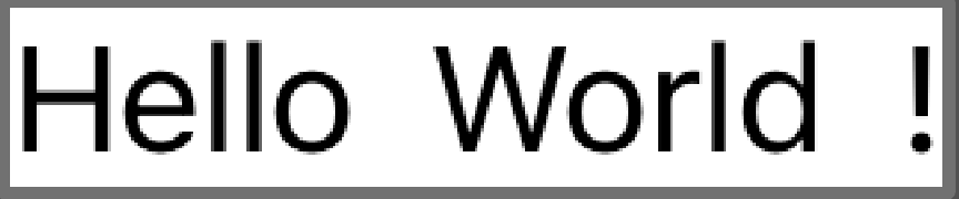 |  |
Basic usage of these is as simple as declaring them and giving them child views.
HStack {
  Text("Hello")
  Text("World")
  Text("!")
}

VStack {
  Text("Hello")
  Text("World")
  Text("!")
}
This lays out the views horizontally or vertically, respectively, laid out across the center line of the secondary axis. While we haven’t gone over the Text view yet, for now, we can view it as a simple and easy way of displaying a single block of text on the screen.
Cards
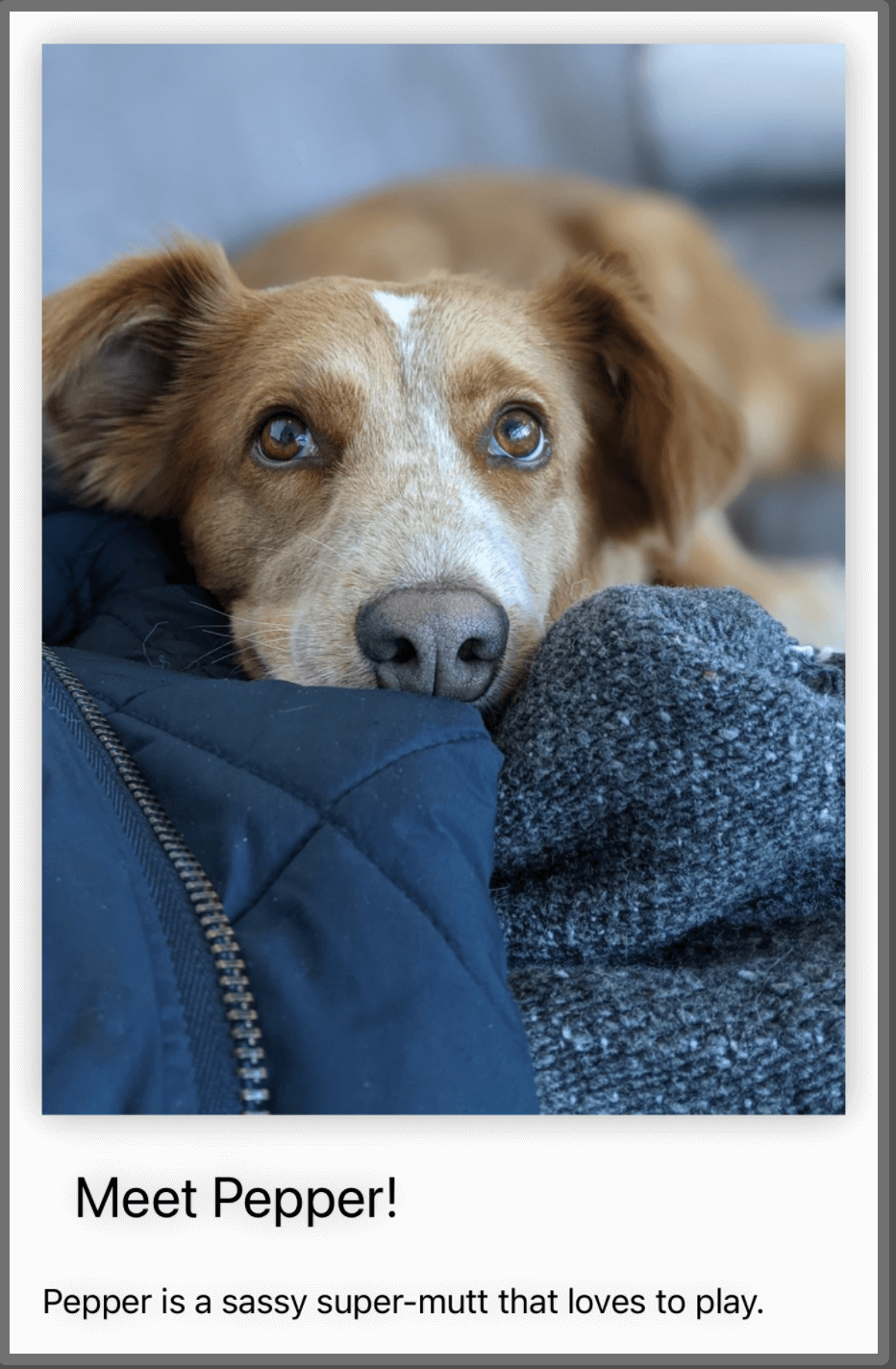 We can use stacks to display cards:
VStack(alignment:.leading) {
  Image("dog")
    .resizable()
    .aspectRatio(contentMode:.fit)

  Text("Meet Pepper!")
    .font(.title)
    .padding()

  Text("Pepper is a sassy super-mutt that loves to play.")
}
.padding()
.background(Color.white)
.shadow(radius: 10)
This example is much more visually interesting, partially because one of my dogs, Pepper, is in it. This example uses a VStack to arrange three subviews: an Image view, and two Text views. In this instance, the VStack has a leading alignment parameter, which means that the subviews are aligned along the left edge of the VStack (in a right to left language, such as Arabic, it would be the right edge of the stack).
The stack has some modifiers applied to it as a whole. It has a padding modifier that adds the system default amount of space around it and its subviews. The background modifier sets its background color to white. And it has a shadow modifier that adds a shadow effect around the card. The result is a view that can function as a standalone card in an application.
Forms
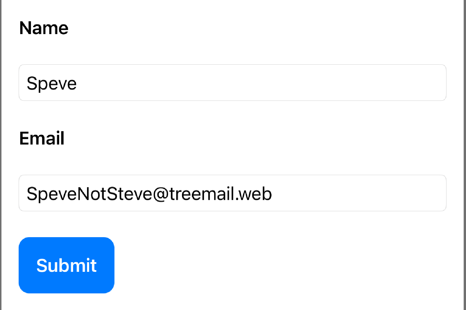
VStack(alignment: .leading) {
  Text("Name")
    .font(.headline)
    .padding(.bottom)

  TextField("Enter your name", text: $name)
    .textFieldStyle(.roundedBorder)
    .padding(.bottom)

  Text("Email")
    .font(.headline)
    .padding(.bottom)

  TextField("Enter your email", text: $email)
    .textFieldStyle(.roundedBorder)
    .padding(.bottom)

  Button(action: { }) {
    Text("Submit")
      .font(.headline)
      .foregroundColor(.white)
      .padding()
      .background(Color.blue)
      .cornerRadius(10)
  }
}
.padding()
This example uses a VStack to arrange six subviews: two Text views, two TextField views, and one Button view. We haven’t touched on the TextField or Button views yet, but in short: a TextField is a user interactive bit of Text, and a Button is a user-interactive view that accepts some action which can perform some logic (submitting a form, making a network request, etc.)
Limitations of Stacks
HStack and VStack are powerful views that can handle most layout scenarios, but like anything else, they have their limitations:
- They can only hold 10 subviews. I don’t view this as a bad limitation. Usually, if a view needs this many subviews, it’s a strong indicator that something in this view is actually a smaller subview that should be declared as its own
View. This limitation can be worked around by using aGroupor nested stacks. - Stacks cannot automatically adjust their layout based on the available space or size class. For example, if we want to switch from a horizontal layout to a vertical layout when the device orientation changes, we need to use a different technique.
- A third limitation is that they cannot create custom alignments for their subviews. We can work around this using combinations of stacks and other techniques to achieve this.
Ultimately, these limitations aren’t dealbreakers and should require only a little extra work or creativity to overcome. In the future, we’ll examine some techniques and strategies to work around these issues in greater detail.